| Art Critique Center |
| « Citoyen » 1469728440000
| 0 | ||
| Please   Dernière modification le 1469730960000 |
| « Citoyen » 1469728980000
| 0 | ||
walianna a dit : omf gr8 art although your mouses face contour looks like a humans and its kinda creeping me out ignore the rushed background, just rate my maus  |
| « Citoyen » 1469773320000
| 0 | ||
Conwolf a dit : Thank you!!! |
| 0 | ||
pluppyz a dit :  sorry if this seems nitpicky, i tried my best not to criticize details that were stylistic choices also sorry for my handwriting |
| « Citoyen » 1470195780000
| 0 | ||
| ill translate the writing for u  |
| « Citoyen » 1471039140000
| 0 | ||
| bumped |
| « Consul » 1471041840000
| 0 | ||
| Critique, please?  |
| « Citoyen » 1471042020000
| 0 | ||
| May someone fix my errors on this, please? :) I know i already uploade dthis on DeviantArt.. Just asking someone to fix my errors. c:  Dernière modification le 1471042080000 |
| « Citoyen » 1471042560000
| 0 | ||
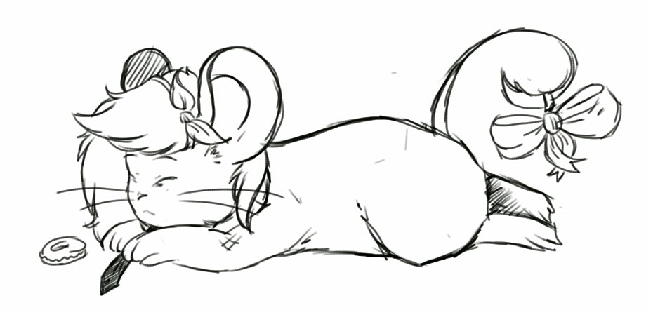
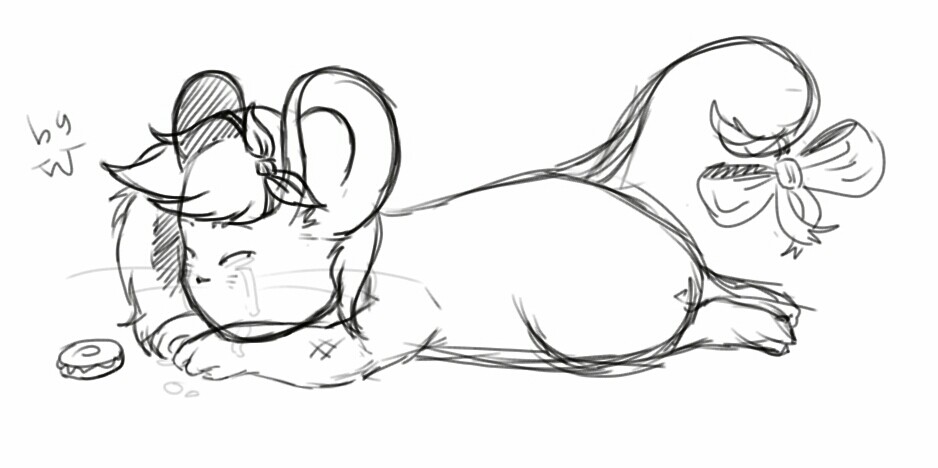
begacheesy a dit : I'm not very good at critique, but I'll try. The ears should be the same sizes, and the inside of the left ear is too close to the head, center it. The forehead is too large anatomy-wise, either raise the eyes or make the head a bit smaller. Can't think of anything else, sorry. Dernière modification le 1471042620000 |
| « Censeur » 1471042740000
| 0 | ||
Funpaws a dit : To add on to this, i also suggest maybe try experimenting with shading, and make your background more than just some green scribbles. Also, your lines are shaky and cross over each other when they shouldnt, maybe try cleaning up your linework a tad. |
| « Citoyen » 1471042800000
| 0 | ||
| hehe thanks guys! ;w; And i'll try.. I'm not that good at shading tbh and i was the same time, lazy so i didn't even do lineart over the sketch, haha. |
| « Censeur » 1471042920000
| 0 | ||
| Try experimenting! Practice until you get better! Also don't you have a digital tablet? Try using some pen pressure. |
| « Citoyen » 1471043220000
| 0 | ||
| Thanks, i'll try again! And yeah, i do but this is really irritating, on SAI, i use the tools to shade with my tablet and barely anything comes out, it just comes as very light grey and or nothing.. Can't do much and i'm still practising using this tablet. |
| « Citoyen » 1471043640000
| 0 | ||
| http://sketchtoy.com/67353167 Ik I made this in sketchtoy, but I want an anatomy check since I usually make my drawings similar to this |
| « Consul » 1471044060000
| 0 | ||
Funpaws a dit : I'm not good at critiques but uh I think the neck could be a little narrower on the right side and that the tail could have a little curve so it doesn't look like a stick or something? otherwise it looks p good |
| « Censeur » 1471044480000
| 0 | ||
Funpaws a dit : The body looks a bit long to me, either shorten it or make the waist thicker. Also his face is a bit too forward, maybe push it back a little. Try to make your lines a bit less shaky. |
| « Consul » 1471044840000
| 0 | ||
Basgetti a dit : I guess I'll just throw this back down |
| « Citoyen » 1471046460000
| 0 | ||
| Okay, this one I actually spent legit time on, I used a reference from my sketchbook irl.  |
| « Censeur » 1471046640000
| 0 | ||
ebotthegreat a dit : Putting this here again Dernière modification le 1471107660000 |
| 0 | ||
begacheesy a dit : not really much of a critique but you should definitely try experimenting with different colors and layers if you havent got to it yet you see. black/grey doesnt leave out much to the drawing, and it makes it look bland. but now that you know it, you should try using other colors to make your drawings look a bit more realistic (i usually use the color orange and purple, give em a try) i've seen some of your recent drawings in your offtopic thread, and i just cant stand how wobbly the lines look like. i can tell that you havent tried out the stabilizer already as it's been several days and you still havent adjusted to your tablet. it doesnt take that long to get used to it... but as for what i was saying, you really should stick with the stabilizer until you're confident enough to make smooth lines without it.. (reminder: the higher the number, the stronger the stabilizer gets) about the layer part, what i usually do is to set the opacity to something like 40-60% (or until the shading is soft and clear enough to see), set it on multiply, put the layer above the coloring layer and clip it so that it doesnt go out of of the drawing you can also do the shading beforehand but eh you can try whatever suits you, this is just my advice |


 Atelier 801
 Transformice


