


| Art Critique Center |
| 0 | ||
| People like to hold onto this thing called a "style" but you kids are honestly too too young and inexperienced to pigeonhole yourselves into only drawing ears or noses or paws only one way because thats your style for some reason (and I'm guilty of this, also). I get it, though, its honestly really hard to let go of something that can feel almost like a part of yourself, but sometimes if something just is not working then you've got to make a change. Look up real mice anatomy, Disney mice, show mice, other artists mice, there's probably some nebulous amalgamation of abstract and anatomical ears that'll fit your mice better than dreamy minimalist ones. Digitalpanda, I wish I could make you draw oranges and blueberries in various planes of perception untill you grasp the concept that a third dimension exists, and I know that sounds mean, but I can't think of any other way to make you understand drawing spheres. The most basic definition of art and the one you will hear most often if you go down this path, is that art is transcribing a three dimensional space onto a two dimensional plane. Most artists start drawing spheres after the first time they watch someone in their class or online draw a head or face, you understood there's a circle involved but you missed step two though ... the rest of it. Please watch artists' livestreams, you need to start grasping at the basic steps that people, even bad artists, go though as they draw. Its not much, but its necessary. Dimensions... There's three of them. I know you're a person (and I feel bad for all these people) who draws what they think they see and not what they're actually seeing, but you've got to stop going ng through the motions and start applying some spacial awareness. There's sort of an arts and crafts project you can do to help you understand faces in the third dimension, which might help to visualize cartoon mice in the third dimension, but I'd have to look for that tomorrow. Dernière modification le 1489478700000 |

 Profil
 Derniers messages
 Tribu
Tribu  Creepinwolf Creepinwolf  « Citoyen » 1489556700000
| 0 | ||
Akinoko a dit : Repost from 28/10/2016 ;-; |
 Creepinwolf
Spooooooooooooooooky  « Citoyen » 1489610820000
| 0 | ||
 desperately need help lmao especially with shading. |
Zombie  « Consul » 1489611180000
| 0 | ||
| something is really wrong with this drawing and i cant tell what it is  |
 Zombie
| 0 | ||
| Akinoko: Perfect proportion, I can tell you've studied what a chibi is, but are chibis really worth the effort? You have more drive and ability than half the site just for using google for something, so with some application and reference hunting you'd draw some good mice. Milkybum: The gravity balance is off by a mile (he looks like he could fall over), and the pose has no line of action to guide the eye (there's nothing to focus on or follow in the drawing). If I was drawing this pose, I would curve the spine up above the legs in their cylinder of space to balance the pose, like someone leaning forward when sitting, to draw a line of action along the spine from the floor upward and inward to the center of his mass. If you want him to be leaning backward and balancing on the base of his tail, you still need to throw out a clearer action line and give this mouse a consistent personality-- look at his bored face but alert upper body posture, it does not flow. I don't know if its a stylistic choice that your legs are half the length of the arms, but thats not generally accepted anatomy. I don't reccomend drawing the face before you draw the pose, you'll end up with wasted time or a bad, forced drawing. Spooky: Shade each sphere of this mouse's fat rolls as its own object. If you have never done an object study in school or whatever, there are resources online to show you how shadows work on spheres in different lightings. Drawing a fat, chubby, happy mouse sitting down because, I presume, its legs can no longer support her obese form isn't a complete waste of time but I know you can do better and put more thought into what you're doing. I want to see the calculation you put into the jumping goldfish one in every next drawing I see from you. I don't want you to draw request after request with no real effort or tact. I want you to treat requests as a project and a God granted opportunity to apply new skills and master basic ones. A request is something you draw for YOU, if you draw requests for the affection of others then you've already hit the wall. Dernière modification le 1489615260000 |
| Zombie « Consul » 1489615860000
| 0 | ||
| ah thank you! i dont think my art is good enough for art school, but im going to try to learn good anatomy before trying to enter.. |
| Spooooooooooooooooky « Citoyen » 1489617900000
| 0 | ||
| that goddamn fat rodent hasnt moved from it's spot in months. it lives only to eat. tysm a0 i owe u my life |
| 0 | ||
| For those of you interested, when you provide a portfolio to an art school they generally ask for portraits of people/yourself, something to show you can transcribe reality onto a canvas. They're not likely to want to see a mouse or an anime character, and they dont care about whether you know what colour is. They want still lifes and anatomical human figure gestures and traditional graphite renders. You honestly don't have to know a thing about anatomy, you just have to be able to look at something and draw it how it actually appears. They want the basic of the basics. Character renders and robots are something for your professional portfolio when you're done with art school. All this cartoon and illustration is complete garbage to them, i'm not trained in it and i'm sure none of the rest of you have any formal training in it, they won't give your application a second look if its filled with things constructed out of memory and anatomical shapes and measurements. They want you to be good but they want to feel as though they can make you better. Because of my level in one of my professor's classes, I was invited to attend nude figure drawing sessions. Thats how you learn anatomy in the big leagues, but I never worked up the nerve. Dernière modification le 1489683000000 |
Katehh  « Censeur » 1489674840000
| 0 | ||
| ok inanimated :) |
| 0 | ||
| I'll take this dead thread as an opportunity to talk about style in reference to Snoweyfeline's drawing (just because I don't want to be reported for off topic.) Okay. Something I heard today from a very amazing artist and art professor is as follows: "An ameture's style is a bunch of bad habits. Don't confuse style with bad habits, or else you're never going to want to learn and change. Professional styles are very researched, very extensive, very consistent styles, and when they break rules they break them deliberately. No choice is accidental, none is because the artist thinks differently, or because they see the world in a different way: they make their choices specifically, they can draw and paint realistically when they choose to do so." I don't have much to add, the artist's YouTube is Istebrack and they have hundreds of hour long videos and guides on how to paint and chqracter design. As far as I'm aware, their work is entirely based on humans (unfortunately) but there's still so many universal tips to glean if you're willing to put the time in. (If you're wondering if all I do all day is find resources, references, instruction and advice, absolutely, I just don't do it here because this community doesn't have any a single professional artist for me to relentlessly pester. So far I've checked off a lot of the basics interspersed with a /few/ more advanced topics (which admittedly is getting a bit ahead of myself, you might think expressions are basic but actually just imagine the amount of anatomy (facial muscles), form (spheres of cheeks and cartilage), and research (how would basic facial muscles form and interact around this skull) you need to pull it off), but I'm consuming everything I can and trying to share the best of it whenever possible. I wouldn't be surprised if I think about art 70 times a day and I'm just getting worse and more obsessive) Dernière modification le 1489715340000 |
Bench_warmer  « Citoyen » 1489711260000
| 0 | ||
| Alright, who wants to critique this sketch-ish art?  ahhh, I see your point now, thank you! Dernière modification le 1489712760000 |
| 0 | ||
| Its not terrible but you need to think more about how negative space will affect the feeling of your drawing, the space around your characters is bland and makes the whole work look ill-thought-out and dull. I challenge you to bring, maybe not perspective persay, but interactions between your characters in a more three dimensional environment, try putting your mice into an imaginary cube and aranging them in a way thats interesting and dynamic. It will tighten the wide flatness of the piece and give the eyes something juicy to dig into. Dernière modification le 1489715400000 |
Fuzbelly  « Citoyen » 1489775640000
| 0 | ||
| Okokokok this art is EXTREMELY off topic, but it was my first real attempt at shading (this is a traditional art piece). There's something bothering me about Hiccup's (the boy's) face but Idk what. I really struggled when positioning the facial features. And a reference was used, though everything was drawn by hand and nothing was traced  vvvvvvvvvvvvvv I do think that the face is very squareish, and quite bland, looking back at it, and now the nose has been pointed out I can definitely see the problem with it being quite small compared to the rest of the face. Thank you both for pointing these features out! I think I was focusing so much on the reference I was using that I didn't think to actually compare it to my actual drawing, and now I can see that. Thanks! Dernière modification le 1489778520000 |
Cloudoflames  « Citoyen » 1489776480000
| 0 | ||
| ^^ Maybe it's the amount of free space there is in the check area, the square-ish face or something about the hair that's by the neck area? You can try using your finger to cover something up and figure out what you think it wrong Dernière modification le 1489777560000 |
| Creepinwolf « Citoyen » 1489776780000
| 0 | ||
Fuzbelly a dit : I can tell that something is wrong with the nose proportion. I didn't study humans faces in this angle, but I can see that it looks kind of short. 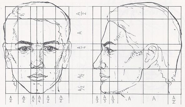 But maybe I am wrong and someone else can help better. |
| Cloudoflames « Citoyen » 1489778040000
| 0 | ||
 |
| 0 | ||
| You're not wrong, the face is off because the artist drew what she thought she saw and not what was actually in front of her. Its a common failing but one that can only be fixed by growing up or being born with a good IQ (if you are an adult and can't draw for shit, there's honestly no hope for you: to use a reference requires a kind of spacial awareness in the brain that's tested for in high IQs, it's why kids draw how they do: they're not stupid or not trying hard enough, the spacial and critical part of their brains haven't developed. Kids fool themselves into thinking they've improved through drawing things the same way all the time without help, but thats actually just the brain becomming more aware of whats going on. In fact, by refusing to use references and drawing from life as a child or teenager, you're practically guaranteeing to fuck yourself over in later life when your brain looses whatever ability it still has to get a grasp of dimensions and perspectives. Pull yourselves together before it's too late.) Cloudo: This drawing would only make sense if a cannon ball was stuck on her back, shoving her forward and, judging by the expression, she liked it. If she's falling, then why is she smiling numbly. I really hope you didn't try to draw her running. The body is actually a really good sketch of a banana, but you need to study muscle anatomy so that you can shade the forms of the body correctly. Dernière modification le 1489789140000 |
Starlightcenturies  « Citoyen » 1489802040000
| 0 | ||
i was experimenting with a toon-y style here, along with hands a bit?? Dernière modification le 1489812960000 |

| Cloudoflames « Citoyen » 1489810200000
| 0 | ||
| @A0xis thank you for the critique I guess I should have added a description of what I was trying to draw before posting but it's supposed to be a mouse free falling ( I guess ) and now that I'm looking at it the shape does look like a banana ( lol ) I tried drawing the cannonball to it and making the face a more reasonable expressions like fear but I had no idea how to fix the body so it still looks pretty weird. I'm planning on just scrapping this and try a different pose. @starlight The drawing isnt really bad, but the waist looks pretty small compared to such a large chest and big thighs and the head looks kind of weird to me. The legs could possibly be longer with the addition of an ear and a slightly larger waist?? I made the arm and hands a bit longer/skinnier and the line you drew to indicate the thumb does help This is what I'm trying to explain  Dernière modification le 1489810320000 |
| 0 | ||
| If Starlight was drawing an actual /cartoon/ and not calling it a cartoon just because it's unrealistic, the drawing could benefit from being even more exaggerated than it already is (bigger chest, stubby legs, macabre long arms-- well maybe not the last one). Its something I've never touched on before, but extending the legs would ruin a stereotyped character design model you've accidentally stumbled upon. Maybe it is best you work on drawing things anatomically and proportionally correctly for now, but when you're ready you can always dip a toe back into these waters where rules are suggestions instread of wading into this ocean of possibility, all alone and with no idea of where to start. Also, your hands look backward because the back of the hands are smooth but the inside of the hands have many bone protrusions and valleys in their folds, even when lying flat, so you can always look at your hand and exaggerate those features so it's more clear and interesting what the hands are doing. Dernière modification le 1489825260000 |