


| Art Critique Center |
| 1 | ||
| References references references |

 Profil
 Derniers messages
 Tribu
Tribu  Rosuuri Rosuuri « Censeur » 1498168020000
| 1 | ||
 something about this feels a little off but im not sure what . just give me ur feedback thankie |
 Rosuuri
| 0 | ||
| The problem is probably the amalgamation of here different styles; the eyes/face is very animeand angular while the upper anatomy is realisric along with the hair texture, and the feet/lega are very cartoon. Other problems ypu might be seeing is the skull nose, the pose not responding to the bouancy of the balloon )typical if the BG was an afterthought and not part of the grand plan), or the papery flatish tail that doesn't seem like its there in the scene. She cutw rho |
| Laderik « Censeur » 1498202400000
| 1 | ||
| what can i do to make this piece better? it's just an old sketch that i would like to re-draw. ..i've seen people post non-mice pictures here before, so if it's not allowed please notify me warning hamilton junkie hhah 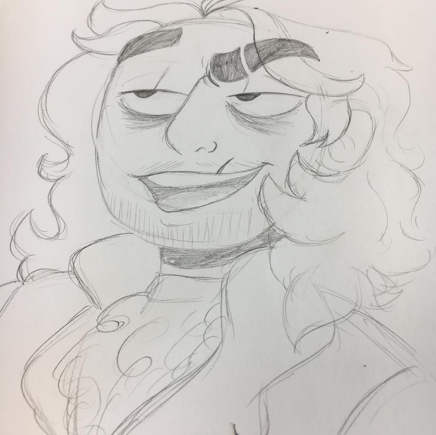 |
 Laderik
 Soricfetita  « Censeur » 1498518720000
| 1 | ||
 |
| 9 | ||
| Critique on this greatly appreciated:  Thanks! Dernière modification le 1499040540000 |

| 2 | ||
| The eyes are close together and therefore the muzzle, supposedly ballooning outwards, is not foreshortened correctly for that form. Dots as eyebrows are used commonly by people who do not structure the face for a brow, this causes the right side of the face to look flat and improbable. Dernière modification le 1499708640000 |
Mikiaya  « Censeur » 1499752620000
| 1 | ||
| @Laderik Overall you've got a lot of character in your drawing and I love the sardonic expression and cartoonization. His hair looks good and is very naturally flowy, blending realistic hair with cartoon hair. Good ear placement + shapes. I would suggest drawing some expressions from reference as it will be a big help for you. The issues I noticed were: Hamilton's left eyebrow doesn't seem to stretch his face, even though it's raised. The nose bridge seems to run into the eyebrow, which makes it look a bit odd, and I would suggest you let the line fade out at the top to fix this. The lines on his eyelids seem unintentional and I'm wondering why you put them there. What's your light source? Be wary of relying on the ultra-dark neck shadow to distinguish between head and neck. @Soricfetita I love the way you drew the muzzle and nose, and the circular pose. The hind feet stand out to me. I'd suggest referencing real or cartoon mice to figure out their structure. The pose is good but a little lifeless, especially with the limp arm. The arm itself looks as though it's been twisted backwards, and it doesn't look as though it's really attached to the mouse, so I would suggest adding a shoulder and referencing + practicing drawing limbs. @Klondiked First of all, I like the style, especially the blocked-in shading. Some issues I noticed: the hatch between the eyes seems out of place with that style and doesn't wrap with the nose, making the image look flatter. The blush also looks out of place, being made with a soft brush while the rest of the colors are blocked in.The eyes look unbalanced as one seems lower than the other and they also look a bit like they're falling off the canine's face due to their odd positioning. I'd also warn against making your character cross-eyed just because it's easy, or adding blushes just 'cause. Where is your light source? I can't seem to figure it out. Dernière modification le 1499761620000 |
Glowsticksss  « Citoyen » 1499756100000
| 1 | ||
| Any critic from anyone will be fine.  |
Begacheesy  « Citoyen » 1499782500000
| 1 | ||
| hi may i get a critique of this?  and  |
| 0 | ||
| Push yourself, be dynamic with poses and camera angles |
| Begacheesy « Citoyen » 1499816940000
| 0 | ||
A0xis a dit : Than you! |
Atearatareta  « Censeur » 1500367680000
| 0 | ||
| try to draw a nose on that human. i know that the coloring is going outside of the lines, and that the arms are too skinny 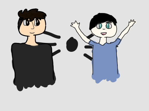 |
Basgetti  « Consul » 1500423240000
| 1 | ||
| ?  |
 Basgetti
| Mikiaya « Censeur » 1500477120000
| 2 | ||
| Atearatareta
Basgetti Your fluff+hair are very good and natural looking and the style is a good blend of cartoonish and detailed. Your lines are clean and smooth and you make good use of line variation. |
Bethdacat  « Consul » 1500644640000
| 0 | ||
 cringe |
| 2 | ||
 This plea?? understand I frequent this thread a lot but it's the only place I know to get art critique fast enough I personally have a real gripe with how the chatot perches on the tail with absolutely no effect on the shading or the shape of the tail but I don't know what I can do for it I appreciate it! Dernière modification le 1500932940000 |
Lolokizka  « Consul » 1501054320000
| 0 | ||
Bethdacat a dit : in my opinion it looks a little stiff? + the right (left for us) leg looks kinda off? maybe it should be a tad bit lighter or so |