| Art Critique Center |
| 0 | ||
 judge my rat |
| « Censeur » 1508095860000
| 0 | ||
| Love the rat! only the face is too much shaped like a bunny the jack 'o lantern has a kinda bad shape and if you could add more shadow to the mouse except for just the ears it'd be perfect! 8.5/10 |
| « Consul » 1508118600000
| 1 | ||
| ^Js, shadows aren't obligatory if it's part of a style-- lineless artwork works really well without shadows (or with cell shading, in some cases) 'v' Dernière modification le 1508119500000 |
| « Citoyen » 1508119860000
| 0 | ||
| CRITIQUE MEEEE 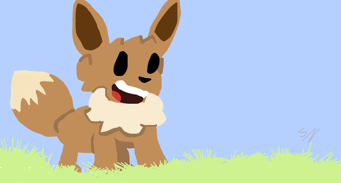 *I drew this on a computer but i think its decent?* Dernière modification le 1508120100000 |
| « Consul » 1508125200000
| 1 | ||
Mega_gengar a dit : Just a couple striking things I'd like to point out really quick ;w; -I suggest you try to take more confident strokes when doing the edges or lines to avoid shakiness, though if youre not quite comfortable with that just yet, you can try using a stabilizer/correction tool -Your shading is a bit all over the place in this one ;w; there isn't a fully consistent light source. Shading can be a tricky thing, so I suggest delving a bit into some basic light/shadow tutorials (you'll see a lot of this sphere, too) -Lastly, I suggest looking at images of eevee's in a similar position to what you were tryna achieve-- there's a lot more floof on the mane and the ears are pointy! X Tbh I really love how you did the face though, I think it looks really cute despite its flaws ;v; |
| « Citoyen » 1508182620000
| 0 | ||
Griffincraft a dit : THANK YoOUUUU |
| 0 | ||
| i did this for Thigaturro in ES 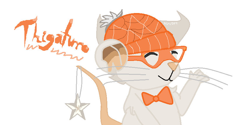 |
| « Citoyen » 1511033220000
| 1 | ||
| ik it's not tfm related but i need heLP  Rebeccademg a dit : My main things with this is anatomy, line art, and shading. Anatomy: As for the anatomy, I would suggest that you google some images of mice? The body proportions are off, especially with the angle and what you decided to draw, which is from the waist? up. It doesn't have the body of a typical mouse that would be in that position, try finding an image that is a similar position and use it as a reference. Also, the placement of the tail wouldn't be there, as the position you're suggesting, it would be sprouting out of the back. Another problem, is the paw, it wouldn't typically be shaped like that and the head is an odd shape. The only thing that even suggest that this is indeed a mouse is the nose, tail, whiskers and ear. Line Art: So, what it looks like you did was just draw out the mouse and then used the fill option with a color of your choice. Try not to do that. It makes it look unrealistic, however i do understand that for some people, it's their style, and if so, you can ignore this c: When doing lineart, it should be something like this without the color, however you should do another layer to detail it. Shading: So, I wouldn't even mention this if you hadn't shaded the ear. The ear is the only shaded part and it throws off your whole piece. If you had chosen to shade the rest, i could say more, but you didn't. Before doing anything with shading, find your light soucre. Also, if you're going to shade, make sure to shade the whole thing or don't shade at all c: ty for reading, and ty in advance for a critique |
| « Censeur » 1511287980000
| 0 | ||
| critiques? 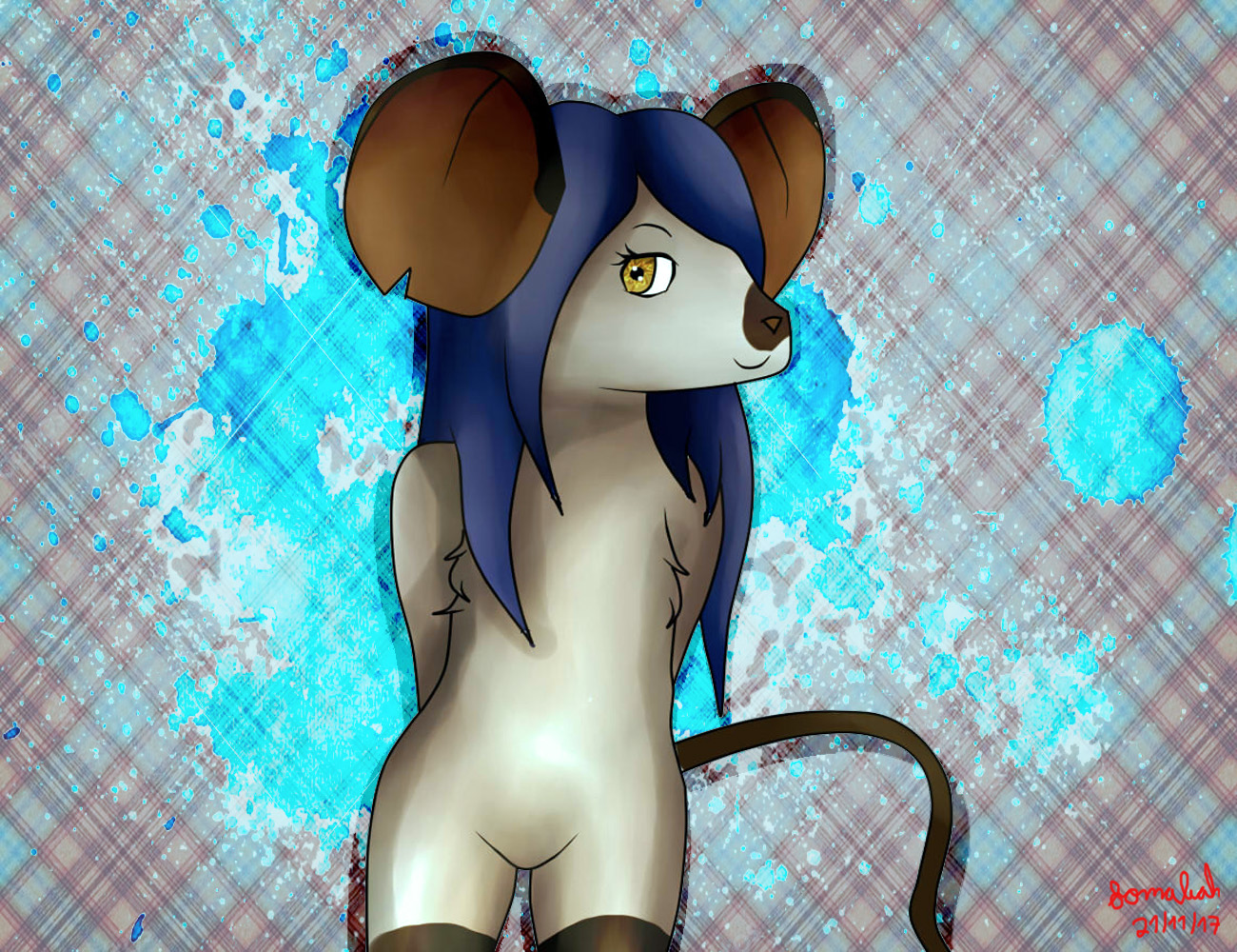 |
| « Censeur » 1527423540000
| 0 | ||
| Critique? x3 This is really a helpful thread btw.. I feel like something's off in this.. It's huge btw 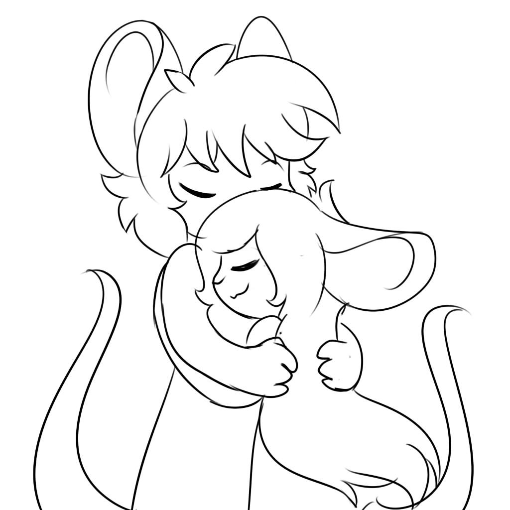 Dernière modification le 1527423660000 |
| « Consul » 1527424260000
| 0 | ||
| @Nemuri: Aww it's really cute! I think the only thing that feels off is the arm of the girl. See, it's not proportional and one part is just longer than the other and that's what makes it weird imo?  Easy to fix tho just shift it a bit outward. :^3  |
| « Consul » 1527426420000
| 0 | ||
| Two pics, you can just do one of them 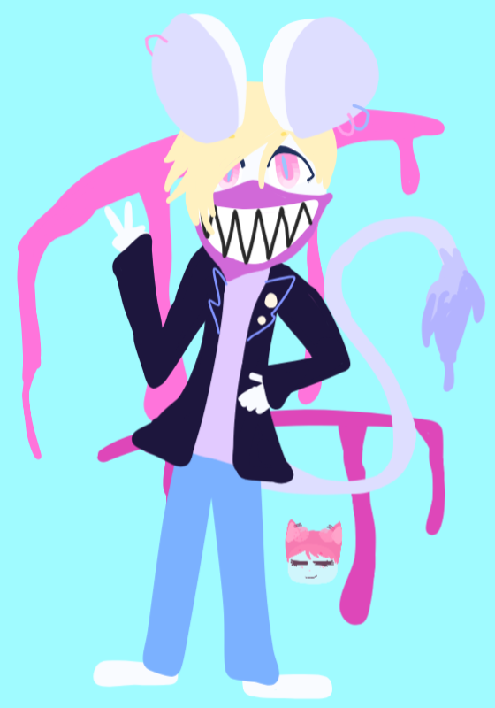  Dernière modification le 1529891700000 |
| « Censeur » 1527794760000
| 1 | ||
| Hii, critique?, be mean o.O  |
| « Consul » 1529891940000
| 0 | ||
| Hi! I feel good about this drawing, but I want to know what you think of it and what you would fix.  |
| « Consul » 1529937960000
| 0 | ||
| Guys, I made that for Chipskink. Am I must fix something?  |
| « Consul » 1529941980000
| 3 | ||
| I'm bad at this, so bare with me. @Cookie_Kitten  I really liked this piece, honestly!! I'm a big fan of gore and your art is uber cute. But your anatomy is still all over the place. (uvu) I tried to redline what your anatomy looks like, then sketch what construction shapes I would use to recreate the same piece. I'll go through it one section at a time. Head There wasn't much wrong I could see here. The ears are nice, and everything seems to be where it should be. Maybe lower the eyes a little. Also, for a front-facing figure (which with yours it was hard to tell if it was a front-facing figure, but judging by the tail's position, that's what I went with, since a 3/4 facing wouldn't have the tail facing the same direction as the head) the figure should be facing the screen. The neck should also be a lot thicker, especially to support a large head like your character's in the drawing has. I'm somewhat afraid that his pencil neck is going to break!! (well, I guess it did already. Haha! gore jokes.) Shoulders, Chest and Arms If your figure is male (and I'm assuming that he is, I apologize) then the shoulders and chest should be a bit broader, since males are built more muscularly. (You can look up anatomy references! They're very useful.) A female's figure would look more like your figure in the drawing, with a slimmer chest and sloped shoulders. The sides of the chest should dip inward to meet the torso at the midsection. (This is why a lot of clothing folds often happen in this area.) The left arm, which I assumed was supposed to be in a neutral position, should be resting at the character's side, rather than out in the open like that. Try standing like the character is in your drawing. It doesn't feel very natural, does it? For the right arm, which I guessed was waving, is angled a bit too sharply. Ease up the sharp elbow angle like my sketch, and it looks fine otherwise. It's important for hands that the fingers are proportionate to actual hands, with the middle finger being the longest and the ring finger being the second longest. (I know it's not that in my sketch, but I'm also bad at hands, so I apologize. Oof.) Also try not to make your fingers look too stubby. Torso, Legs and Feet Your torso slims down way too much. The hips should expand slightly as opposed to the midsection, which is what slims inward. For your legs, they look too stiff, and the knees are nowhere to be seen. The feet look like they're bending in awkward directions, which would be painful to stand like naturally. In a front-facing position, only one foot can bend entirely sideways and still be natural. The other would be 3/4 or front-facing. There's not much to say about the tail, other than try not to make it curl entirely inward to make it look more natural. Body Posture Your character looks sortof like he's about to topple over. If he's merely standing, then attempt to make him look like that. Look at references if you need to. It's not a bad thing to do. Blood It's just what I think, but your blood kindof looks... gloopy? Blood is a liquid, so it's important to make it look flowy. A reference I put in the picture is a good idea if you're going for something that looks flowy, but still (gloppy? gloopy? I don't know what adjective to use! ;;) The Movement An important factor in gore drawings is movement. If you look at references, you can tell that a lot of them seem to have some sort of dynamism to them. They all seem dynamic, even if they're simplistic. Try dynamic poses, or find ways to make a simple pose dynamic with the character's colors, blood, or features. Background The colors that the background and character have make it a bit difficult to distinguish them. (For example, it took me a minute to find his left foot. I thought it wasn't there for a second.) Try making your background darker or lighter, or contrasting colors entirely. Dernière modification le 1529942040000 |
| « Citoyen » 1529955600000
| 3 | ||
| hiiii here is my recent stuff   |
| « Censeur » 1533402480000
| 3 | ||
Cookie_kitten a dit : Loving the pastel color in here, hope you dont mind me talking a little more on how you can enhance what you want to show to your audience! For Cookie_kitten 1) Value! At the current moment, the character seems to really blend into the background, making it hard to see! I do know some artworks out there has even the bg and the char very similar in value, but that was compensated with a different color so the character still stands out! example from one of my fav artist, Krenz 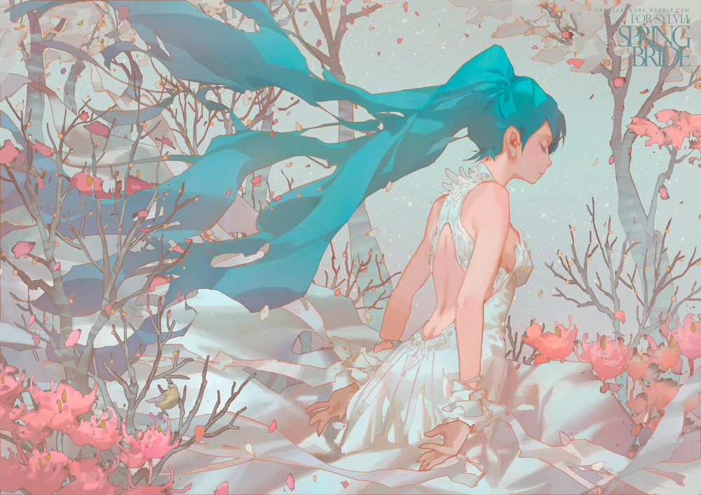 However, your bg is quite busy, thus making your character blend in and lose its focus. I did an edit where i darken your character and lighten the bg! added in a white border around your character also helps to emphasis, because white is the brightest value and people will take not of it if theres no other outstanding values (like black)  2) Not sure how to call this, "Maintaining volume" maybe?  Seems like this is drawn on a phone and i do know how hard it is to draw in a layer with a hardbrush. Normally when you want to draw a seperation of two things, you kind of draw them seperately but then it ended up looking like the shape deformed and that they don't really look like they connect. Try drawing the full thing and cutting them out later (or draw over!) My paintover! I feel those are what you can focus on a surface level (and I hope those help), I do have other advise but those are coming into art fundamentals which I don't want to force you to do. I know the style is stylized, but having some fundamentals can help your artwork! I did a paintover and a brief underlining thought process i have that includes the fundamentals. Again, want to stress that these are optional and not forcing you to learn fundamentals just because "if you dont learn them you are a scrub". I feel that using fundamentals is a way to enhance what you want to say. If they serve what you want to say in your artwork, then by all means go for it!  Black - Gesture Green - Line of action towards main focus Red - Volume and perspective underneath your character  Midnightokyo a dit : Cute works and lovely style, just some quick critic on your 2nd piece o/ For Midnightokyo 2 'anatomy' things i notice would be.. 1) Ear not connecting to the head : Use to have this mistake so you arent alone, Because we draw the hat or hair 1st before the head and ear, we draw them sperately and it makes the ear not connecting to the head. Normally just draw the underlying head and ear without the accessories would solve it o/ 2) The heels of the feet somehow just cuts through the fur is a little weird, theres normally a protrusion there :0  Other than that, i just found your nose to be slightly slanting down. You can check out in my paintover below o/ Hope these help in some way :0   |
| « Consul » 1533445560000
| 0 | ||
 this pls thx |
| « Citoyen » 1533447600000
| 4 | ||
| hello kallen great work as usual. you have some great direction from the cast shadows. I would suggest working on detailing this picture further by including a larger range of values, in the lit side by using midtones and also in the shadows by adding reflected light. Some areas are looking pretty flat because there isn't much plane shifts aside from the seperation between light and shadow. The following may also depend on style, but in general, black or white outlining isn't recommended because it doesn't accurately represent the edges between objects in your drawing, but if youre going for a chibi/simple style, it works. |


 Atelier 801
 Transformice
