| Art Critique Center |
| « Censeur » 1493417700000
| 0 | ||
Kaekat a dit : Hmm.. when I drew with a mouse I generally used the Curve tool for characters with a Lineart layer. ^ For SAI Dernière modification le 1493417760000 |
| « Citoyen » 1493982360000
| 0 | ||
| Anyone know a good program :O |
| « Consul » 1493984460000
| 0 | ||
Sleepy_panda a dit : a good free one is firealpaca but sai (unless you pirate it) is a good paid program |
| « Citoyen » 1494221160000
| 1 | ||
| Please critique! Anything goes you can even sugest to exclude or include some things, you can also be brutal.  |
| 13 | ||
| If you drew out the perspective lines on the paper bag (extending the line of the edges until they met), you'd see your random placement of the vanishing points. It's no good for me or anyone to fix the bag on this drawing, you need to fundementally understand perspective so that you can draw any box or bag or building without trouble for the rest of your life. I, for one, never draw the perspective ruler lines and you'll never see any other artist draw them either (unles you watch an architect or vehicle concept artist work, anyway) because the more you research perspective, and the more you draw boxy objects from life, the less necessary drawing the ruler lines will become (it's called building a mental reference library); at your level, though, I would recommend actively imagining and mapping perspectives. Keywords for you to define as homework; Horizon Line Vanishing Point Two Point Perspective The creature is simple and commanding of its position in space, but if he put his right paw down you might find it a bit too long compared to his left. The face is something so important to any character sketch that telling you how to draw it would be wrong of me or anyone, since so much depends on a red wheel-barrow glazed with rain water. I find it necessary to map abstraction rhythms onto animal photographs in order to translate their anatomical forms onto a rudimentary style... but thats a bit much to dive into at once. Just dont be afraid of your drawings being ugly; art is a journey with slips and terrible falls, but playing it safe won't get you where you want to be if you want to climb that mountain at all. If you dont want to see how that journey goes, like many people who decry my words, you won't lose anything by walking away or setting up camp. The top is lonely, after all.. Its a good thing I have nothing to lose if I ever get there. Dernière modification le 1494279120000 |
| « Censeur » 1497038940000
| 0 | ||
| could anyone give some critique on this?  any kind of critique is appreciated sorry for bumping thread |
| « Consul » 1497039420000
| 3 | ||
Mandymuis a dit : yo so im not the go-to person for anatomy and all that but id like to point out the shading a bit there's a kind of "pillow shading" in some spots? if you havent heard the term, id google it because youll understand when you see it. a few spots i noticed that im talking about  from the looks of spots like the tail, i assume the lighting is meant to be coming from the right of the image. but the spots i drew over (and more than those because i only did a few) kinda wouldnt work with much besides lighting coming from the front, and even thats a bit of a long shot. kinda unhelpful and short sorry ack |
| « Censeur » 1497039780000
| 0 | ||
Shardpixel a dit : thank you for the tips! yeah, i'm still struggling with shading especially, mostly with where the light should be coming from i kind of wanted to have the light source come from the right at first, but i felt like some places looked really empty so i wanted to shade those too i'll pay more attention to the light source next time i shade e: @a0xis, thank you as well! ooh, i'll try it out vv Dernière modification le 1497040920000 |
| « Consul » 1497040260000
| 2 | ||
Mandymuis a dit : if the lighting is coming from one side or another, i'll tell you that you'll probably be bothered by the amount of shading on some parts and the lack on other parts (but mostly the abundance of shading). i feel like a lot of people are a bit worried they shade too much and then dont shade enough. actually, a good way to shade (in my opinion) is to cover the entire drawing in the shade color, and then erase the spots where light would hit rather than shade. i think it helps people envision how lighting lands a bit better |
| 3 | ||
| I would hate to complicate the issue with bounce light and secondary light sources and cast shadows, but its best to understand the existence of the many many concepts that go into a realistic render to be able to pull of the most righteous minimalist or cell shading. Also think of light as existing in front of and behind objects in a three dimensional space |
| « Citoyen » 1497045300000
| 1 | ||
| I've been working on my new profile picture which is what I wish my mouse looked like humanized, and I wanted to get some critique on it before I started to ink and color it. Any intensity of critique is fine and appreciated, as are red line versions, etc. I WOULD like some tips on shading the hair / clothing or on the eyes in particular, but feel free to leave feedback on all parts of the drawing. The drawing:  Sorry it's giant and the colors seem faded in the picture. I didn't want to make it so I can't erase it yet. This is the mouse I've been basing it off of, even though you can only see the hair and fur at the moment.  Thank you! Dernière modification le 1497045360000 |
| 0 | ||
| Look up a face proportions guide or research the "thirds" method of placing structures of the face. There's no point asking here for help when you need to start with the very basics. |
| « Citoyen » 1497047400000
| 2 | ||
 Critique please! Digital coloring tips would definitely be helpful. Thanks! |
| 1 | ||
| The proportion is really close in terms of human proportion but you need to imagine what this character would look like standing up because that mouse is very, very tall. (If you weren't going for human proportion.... Maybe refer to references.) I've never been a fan of the flat-faced furry/anime way of drawing but it works better for your very human anatomy--- if you didn't give the mouse wolf paws. Mice have hands, I promise. The ears are very wolf-ish too just so you know. As far as the shading goes, I can tell where your light source is.. But a lot of the cast shadows are missing. Listen-- an object like an ear doesn't exist in space by itself, shaded by its own existence. The shadow on a cell shaded object is where the planes of the curve begin to face away from the light, but the object is going to cast a shadow, also, onto whatever object is behind it-- which starts sharp where the cast shadow is closer to the object but fuzzy as the shadow is away from the object. Turn your light on and slap your hand as high on the wall as possible to witness this phenomenon. You have the cast shadow on the tail but the cast shadows are not limited to only objects that are separated from each other. |
| « Consul » 1497313200000
| 1 | ||
 I'd like critique on this ;w; I do reckon that the tail looks weird, but besides that I'd like to know if anything else looks off 'v' |
| « Consul » 1497596160000
| 1 | ||
 critique please? im not very confident about the nose, eyes and the hair |
| 0 | ||
| Despite the fact your face is angled downward, your nostrils are as though on a horizontal plane. The whole face is very "safe"; not pushing for any interesting features or attractive edges... As though your eyes are the symbols of eyes and your nose is a symbol of a nose and your mouth is a symbol of a mouth-- none have any interaction or bussines with the other, you've just drawn the most generic of basic features in a general proximity of a face. I'm not saying it's bad, I'm just asking why you dont push yourself and start collecting references and completing nose, eye, lip and bone structure studies. This face could certainly be someone's real face, but my guess is that it isn't. Put your thumb over her left eye (the right eye) and hold it there a minute, when you remove your thumb you'll see it. Dernière modification le 1497600120000 |
| « Consul » 1497602400000
| 1 | ||
| ^ thank you, i'm actually planning to take studies, since i haven't actually learned anatomy or anything, i've just drawn fro mreferences and the drawn picture is actually me, i used a picture reference the left eye (right eye) in my opinion looks more kind of lazily done, and i read that you're supposed to draw both eyes at the same time sort of, but i keep forgetting that. |
| « Censeur » 1498072320000
| 0 | ||
| This is not mine  |
| « Censeur » 1498146960000
| 0 | ||
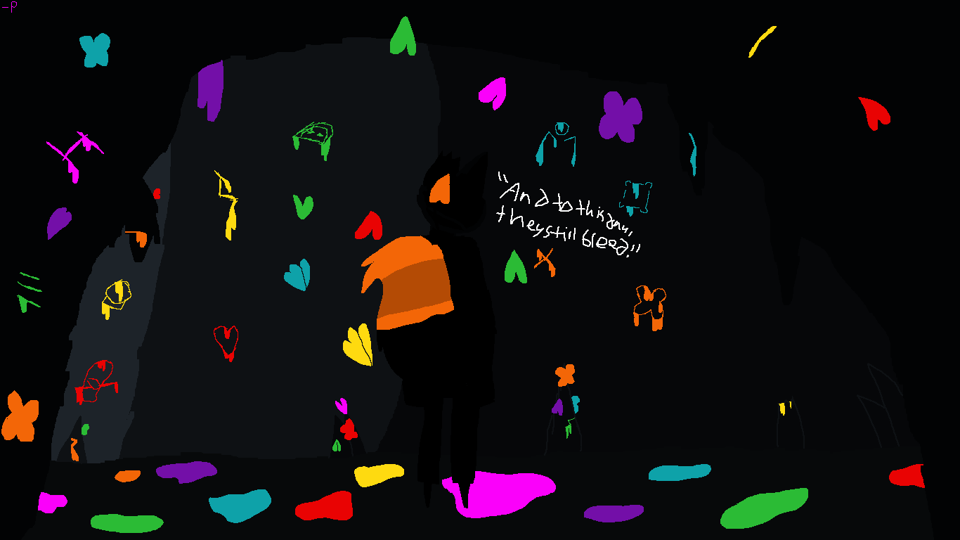
| i'd mainly like tips on the area itself and not the character. i want to know how to make the cave more mysterious yet beautiful, with the bleeding rocks and glowing moths thing in it. something like waterfall from undertale and the dark world from yume nikki. tips on drawing moths would be nice, too. (and perhaps a name for the area itself, as i'm trying to make a game and this little drawing is only to give people a taste of one of the areas.)
|


 Atelier 801
 Transformice


