


| Art Critique Center |
 Starlightcenturies Starlightcenturies  « Citoyen » 1501554600000
| 0 | ||
|
some things i'm aware of: |
 Profil
 Derniers messages
 Tribu
Tribu
Mistalee  « Citoyen » 1501846200000
| 0 | ||
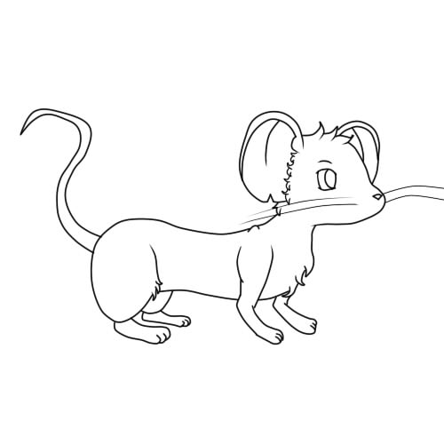
Starlightcenturies a dit : Regarding the tail, I think you'd just want to make it 'fluffier' (less spiky furs) since to me it looks like that was what you were going for in the rest of the fur parts. Also making the middle part of the tail thicker might help. And for a simplistic style like that, I think the paws themselves look just fine. But I'd make the limbs a bit longer, unless that shortness was what you were going for. In general, at your skill level I suggest you to do 2 things: practice anatomy and just draw more, because you will automatically improve that way! It may sound cliche but it does work, just ask anyone who has done art for a long time. Dernière modification le 1501846260000 |

 Mistalee
 Shardpixel  « Consul » 1501863000000
| 0 | ||
Starlightcenturies a dit : it helps to draw the shape of the tail that you want first, and then add fur into that shape. also, as mistalee said, use less spiky fur on the tail |
Izupen  « Citoyen » 1501923360000
| 1 | ||
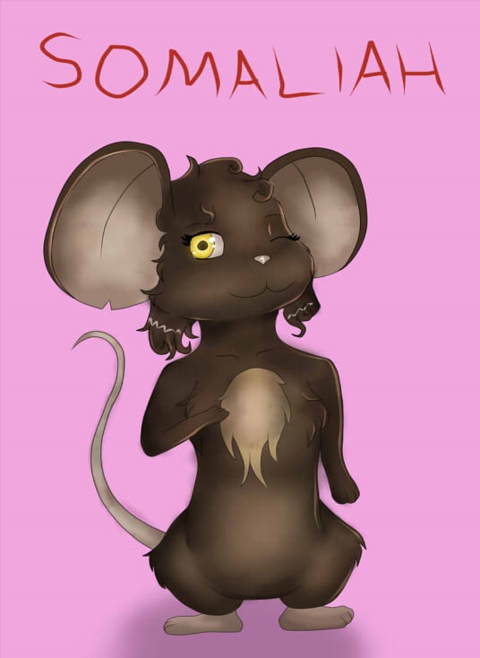
Bethdacat a dit : the thing that stood out to me the most is the background. I'm not sure if you picked the background because you likes it, or if you were trying to match it with the eyes, but it seems a little too bright and doesn't really fit very well with the colors of the mouse. Also, the shine of the hair is a nice touch, but it looks a bit too bright imo. Try to lower the opacity the layer or the brush next time.  This was an art request I drew for someone a few months ago. Yeah, I said it's a few months old, but my art style still looks exactly the same. hngg i really shouldn't have put that giant watermark there, it ruins the picture |

| Shardpixel « Consul » 1501965120000
| 1 | ||
Izupen a dit : an immediate issue i notice is how everything is lost because of the colors. you have to strain to see the lineart in certain areas, and the entire thing blends into the background because it uses a nearly identical color. the other issue with very dark base colors is that shade either wont be visible, or will be solid black; the latter can mess up the lineart among other things if your original intent was not to have black shading. for a character like this, id suggest lightening up a palette that suggests these colors but also makes the character much more easily seen. another thing you could do is look into highlights. not only would it be more fitting for a moonlit picture, but it'd also help show edges and shapes that are hard to see with the dark colors. |
Soricfetita  « Censeur » 1501974840000
| 1 | ||
  Dernière modification le 1502043840000 |
Shumesia  « Citoyen » 1502053680000
| 1 | ||
Soricfetita a dit : warning: !!poor quality critique but tried my best!! well done for trying out dynamic poses and different types of shading!! the anatomy looks pretty decent although the feet look wrong, they remind me of chicken feet yes they do look similar but   i wouldn't see a problem if that 4th finger wouldn't be so high up also the fact that you added a 4th finger gives the impression of wanting to achieve a much more realistic look, but it doesn't quite fit with the rest of the drawing another thing about the feet, they look disconnected from the rest of the body because of that line  if you really want to show the difference between the skin and the fur you could just blend in the colors and stuff the right foot is turned quite weirdly because it doesn't match with the rest of the flow, maybe something like this would work??   as you can see from the picture above, mice don't really have paw pads, but even if they did, they wouldn't look so 3D (??). you just added a lot of detail and shading which makes it look like a glued on gem- ball* WEARETHECRYSTALGEMSWE'LLALWAYSSAVETHEDAY i don't know if he's jumping, falling or just floating, but keep an eye on the tail as well, especially the way it's affected by gravity.  i would probably do this but it might be wrong as well i would probably do this but it might be wrong as wellok shading. even if you're just experimenting and testing stuff out, it looks too bright to me, and distracts the eye from the actual piece. i would suggest desaturating it a bit. also think about the background as well (even if you're not drawing it), because it affects the main object a lot. for instance, if your background is blue (let's say the sky), that light will reflect (insert random science here???) onto the object and ??? um?? you get it, the shading/lighting will have a blue shade to it. just look around at every day objects and see how this happens in real life?  the red from the tomato in the cup :D:D the red from the tomato in the cup :D:Daaand it's not clear to me where the light source is, it seems you just shaded the edges randomly. one way to fix this is by filling the whole drawing in with the shading color and erasing away the spots where the light falls (from a specific light source of course) so overall, just practice the mice anatomy more (even if you prefer an anthro style, knowing the basic rules is essential before breaking them) aaaand keep drawing, don't worry if a piece is not perfect in your eyes, finishing it and getting on with a new one is much more important. |
| Soricfetita « Censeur » 1502059920000
| 1 | ||
| thanks a lot!!! I will keep this all in mind next time. and your critique was done well! |
| 0 | ||
Klondiked a dit : |


Dexter  « Censeur » 1502294220000
| 1 | ||
  redline pls Dernière modification le 1502295240000 |
Griffincraft  « Consul » 1502310720000
| 3 | ||
| ^Just one thing I want to point out about the second one, the body is far too long and slim to be a mouse   A mouse's back is curved outwards, not inwards. Similarly, they have round bellies-- the dip in their stomach shouldnt be so extreme. I recommend you use references when drawing rather than drawing from memories. It's not considered cheating and it'll help you a lot in the longrun 'v' There's other things I would like to point out, but im busy rn orz |
| Dexter « Censeur » 1502315580000
| 0 | ||
| Thank you, It helped me so much |
Macaronnie  « Censeur » 1502390100000
| 0 | ||
 Looking for criticism on this as I'm not very experienced with dynamic poses. Mostly looking for criticism on the anatomy, especially the body. (It's a cat, in case you're wondering) |
Glowsticksss  « Citoyen » 1502459040000
| 0 | ||
| Critique?  |
| Soricfetita « Censeur » 1503185580000
| 0 | ||
 |
| Sodasilver « Censeur » 1505932200000
| 0 | ||
 its chibi. |
Bunsen_burner  « Censeur » 1506295920000
| 1 | ||
| made this in paint, i'm actually really proud of it oh and if you say anything about shading, i don't shade much of my art, so that's why the shading looks really weird.  Soricfetita a dit : Looks pretty good, but the anatomy of the mouse looks weird to me (The chest, the muzzle, etc). But if it's part of your style, I can kinda excuse it. Dernière modification le 1506296280000 |
| Shardpixel « Consul » 1506306240000
| 3 | ||
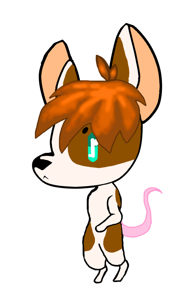
Chipskink a dit : This is a cute drawing! I think the eye is unique Anatomically: -The head shape doesn't read "mouse" well on its own. The sharp angle at which the snout sticks out represents something more of a canine than rodent. -The ears are a bit off. It's partially the point they form, as well as a sorta 2-dimensional, flat feeling they give off. Take a look at mouse ears, and if you still don't understand what I'm saying (because I'm wording it poorly), just let me know! -Take a look at the head and ears on this image:  Other stuff: -The tail seems positioned a bit too high on the mouse. It looks like it juts out of the middle of its back. -The hair is out of place for several reasons. -For one, it covers absolutely everything, while nothing covers it. It looks like it was pasted onto its head. a suggestion would to be to have the ear poke out in the middle of it. That way, the ear covers the hair behind it, while some stays in front of the ear. It won't look as flat. -The entire piece is flat color, until you make it to the hair, which has some rather detailed shading on it. It conflicts with the rest of the drawing. If you like the way it looks, I'd strongly suggest that you shade the rest. Otherwise, I would keep the hair flat / VERY minimally shaded / defined. |
| Sodasilver « Censeur » 1507395720000
| 0 | ||
| thanks! i will improve :D |
| 0 | ||
| So.........  *kills herself* Ok... I made this with Paint and I'm really proud of this If someone wants to know who she is, she is Blue Zircon from Steven Universe Arandommeow a dit : It looks cute! And yep, the shading is a bit off BUT DON'T WORRY MY SHADING ALSO SUCKS Dernière modification le 1507413720000 |

 Rebe
Rebe