| Art Critique Center |
| 1 | ||
 |
| « Citoyen » 1543319640000
| 0 | ||
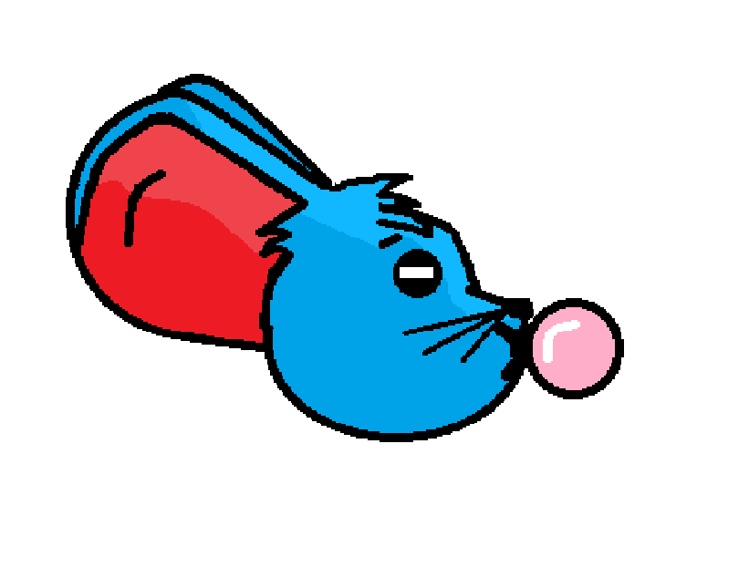 critiques please? I made this with paint on a computer without touchpad :d |
| « Censeur » 1543361820000
| 0 | ||
Ugly a dit : I think this is overall done pretty well, however you might want to try blending the shading a little more. You should also try to highlight some areas, too (ie the mountain right next to the sun). Great job tho! |
| « Citoyen » 1543368540000
| 0 | ||
 |
| « Censeur » 1543369680000
| 0 | ||
Cascadepearl a dit : Try to make the utters look like they’reattached to the body. When I first saw the image I saw the mouse, then I noticed the utters as a totally different object. |
| « Consul » 1543379520000
| 5 | ||
Cascadepearl a dit :  the back ear would have to twist pretty uncomfortably to look like that the udders have a few problems that make them look out of place: -it's a bit too high up. this makes it feel like the udders are a part of the belly and it ends up looking a bit awkward -it's not centered properly -it seems to lay flat on the mouse. to resolve this (and to help center it), it's good to imagine/sketch guidelines to remind you where the middle of a body part is or where the body part curves inward or outward. you dont even have to draw it out, but always remind yourself that while youre working with 2d shapes, theres plenty you can do to create the illusion of 3d. it gets easier with practice! |
| 1 | ||
 |
| « Citoyen » 1543414440000
| 3 | ||
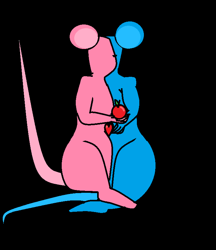 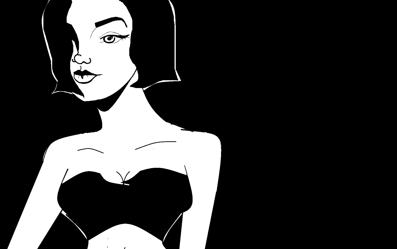 ] ]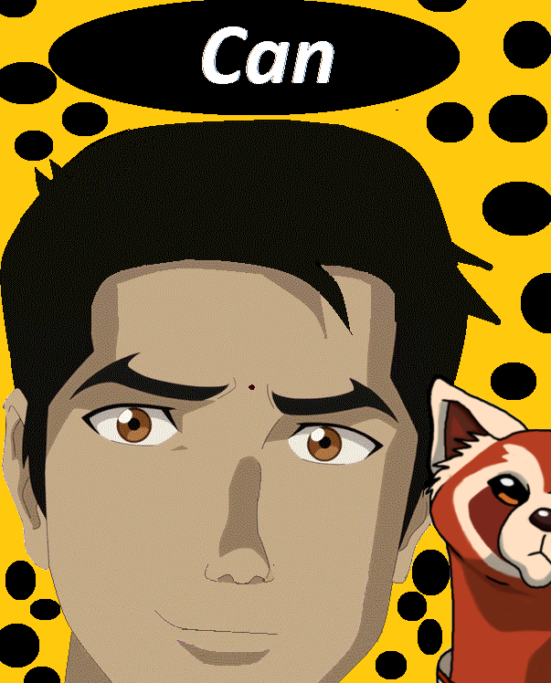 ] ]oh and I don't know if we only judge fanart so I posted the human ones sorry if it's only fanart? Dernière modification le 1543414740000 |
| 3 | ||
 Any help would be extremely appreciated thanks so much I rlly need some assistance i gotta crank it back into gear |
| « Consul » 1543705020000
| 4 | ||
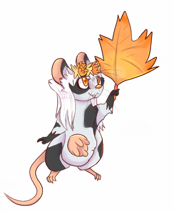
Ugly a dit : Nothing there with the shadows reallllyy works. You airbrushed the shadows to death, making it look flat, and with the lightsource seemingly more from their right (viewer left) rather than from behind. There's no dimension to the grass, it sort of looks like you put a sticker overtop-- I'd recommend having the character "sink" into the grass more, meaning that there'd be strands of grass overlapping their paws etc. The cast shadow is also lazily done; if the light is from far behind them, there wouldnt be much definition all throughout the shadow, it would start fading away. Dont be afraid to take more time on a drawing, play with the shapes-- study shapes, it'll help in the long run. also, dont be afraid to hide things in shadow, it might just make more sense Sidenote, don't shade with black, use colors. This drawing has the potential to showcase complementary colors (orange (light) and blue (shadow)) which adds another level of life quick overpaint  Dernière modification le 1543705140000 |
| 2 | ||
Griffincraft a dit : this is actually really helpful, thanks  |
| 0 | ||
| 1 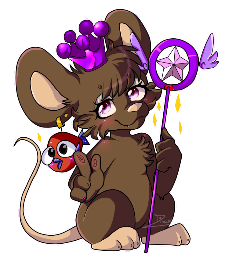 2 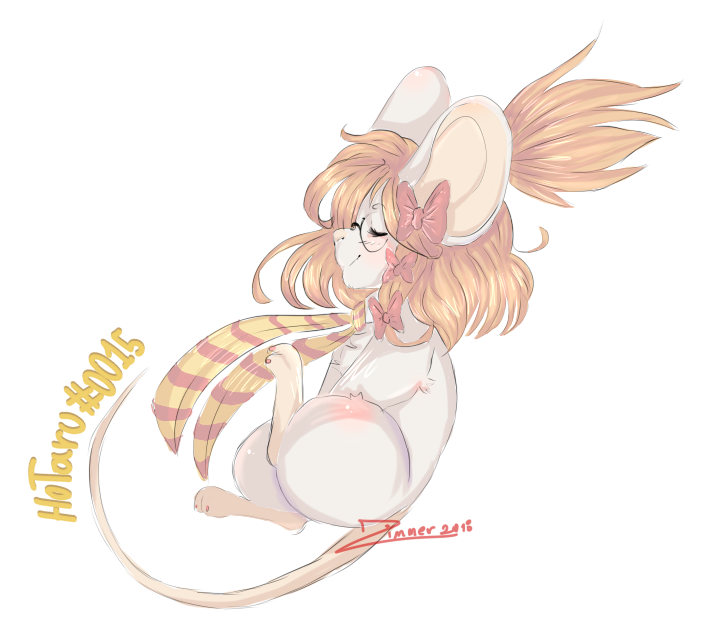 |
| « Censeur » 1544099640000
| 0 | ||
Zimmer a dit : *-* |
| « Consul » 1544134080000
| 2 | ||
Ugly a dit : Very nice! The light source for this one is coming together well, although I will say youre still using the airbrush a lot and have a lot to learn and understand about shapes-- it shows, for example, with the flat shadow you did on the tail spikes, because you treated the tail as a flat surface rather than a rounding object. There'd probably be a bit more lighting around the silhouette of the char since the moon is so large and bright-- and also, unless the moon is sitting right between the hills, the one on the left would have a total rimlight too. Here's a couple links that might help you: One Two Three (all proko, but theyre good! lol) I also suggest you do your own research, and that you also look into contrast and how that helps, because I can definitely see a few areas that could do with some extra contrast o/ best of luck |
| 1 | ||
Griffincraft a dit : thank you again, i appreciate it! |
| « Citoyen » 1544171940000
| 3 | ||
a dit : Griffincraft did a great job explaining form but I just want to add on a little about the background. One thing that can easily enhance your drawings is adding depth to the background. Hills are rarely standalone and mountains come in ranges. Here's a quick paintover (albeit crummy) to show what I mean.  Now here's some main points to focus on. 1. Use references! I literally googled "hills at night" to get some reference pictures. Reference One In this image, you can see three very important things. One, the further away the mountain is, the lighter it is. Two, the sky surrounding the mountains is actually brighter than the mountain itself. Three, the sky gets darker as you go up, and lighter as you get closer to the ground. This is pretty universal for anything, day or night. 2. Generally speaking, if you can see the mountain/hill at all with a character so up close, the hill is already a great distance away from your character. You can see how small the horse is here in comparison to the hill. So taking this into consideration, we would be assuming that your character is already pretty far away from the hills, meaning all of these light rules I stated above apply to the background! Backgrounds and environments are by far my weakest points as well, so don't fret! This is tough stuff. Keep it up and keep using references! Dernière modification le 1544172060000 |
| 0 | ||
| thank you so much!! Dernière modification le 1544214000000 |
| 0 | ||
 |
| 0 | ||
| nevermind Dernière modification le 1544520540000 |
| « Citoyen » 1544985540000
| 0 | ||
   It would help me a lot, these are the last drawings that i did, two colored sketches and one finished. Thank you!♥ |


 Atelier 801
 Transformice
