


| [In-game] Profile Revamp |
 Dea_bu Dea_bu  « Consul » 1489529400000
| 26 | ||
| Recently, there was a tribe & cafe revamp, so I thought... why not have a profile revamp? I have taken in consideration a few other suggestions made by users, if I can find the right threads, I will link them. At least I told you! Simply, a new layout would be very nice for the profile, I will explain everything in the next 2 spoilers. Current Layout
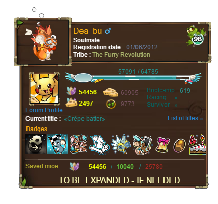
Possible Revamp (1)
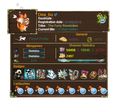
Possible Revamp (2) - This takes in consideration posts from 1 to 20
Thanks for reading through this suggestion, leave any questions if necessary! :) Dernière modification le 1489597980000 |

 Dea_bu
 Profil
 Derniers messages
 Tribu
Tribu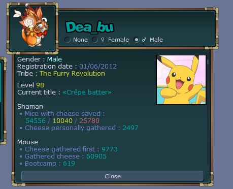
Missiclinda  « Consul » 1489529460000
| 0 | ||
| /support :^) |
 Missiclinda
| 0 | ||
| oooh that's adorable! support omg |

Animalkirby  « Citoyen » 1489530060000
| 0 | ||
| The thing is, the cartouche in-game shows how many skill points you have personally used, not your level. Unless you're stating that it won't show how many skill points you have used and just the level instead, dunno how that's gonna work out. So for now until further explanation, I will be doing a /HalfSupport This may probably change in the future. Don't quote this either since I'll edit this once I change my mind Dernière modification le 1489530180000 |
| Dea_bu « Consul » 1489530240000
| 2 | ||
Animalkirby a dit : Oh yes, completely forgot about that! Thanks for reminding me! :) Will see what I can do about it. |
Chlobro  « Censeur » 1489531200000
| 1 | ||
| /support the layout looks wayyy better that way |
| 0 | ||
| /support awesome layout, i can tell you put a lot of effort into this and i appreciate that. |

Cloudoflames  « Citoyen » 1489533180000
| 0 | ||
| by "a window will pop up"do you mean a completely new tab or something pops up in game |
Jittercritter  « Censeur » 1489534680000
| 0 | ||
| oooooo i really really like this |
Kingphillip  « Consul » 1489536180000
| 1 | ||
| /support I'm all for it, but I don't really care about the profile |
| 0 | ||
| /support |

Sar33aj  « Citoyen » 1489539240000
| 0 | ||
| I usually don't like updates but I actually like this one. /support |
Purpledimond  « Censeur » 1489541160000
| 1 | ||
| /Support though I'd prefer if it weren't so bunched up like that because it kind of hurts my eyes. Nice job on the 10/10 photoshopping though ^^ |
| 0 | ||
| /support It's about time the profile look to get changed. I like the new one. |

Ash_willow_iz  « Consul » 1489565040000
| 0 | ||
| /support X 75℅ But I feel like it seems bit cluttered and the color is bit too warm.( maybe cuz seeing for the first time). Maybe a bit more rearrangement makes it ok. |
| Eironeia « Sénateur » 1489566540000
| 1 | ||
| /nosupport |
| 0 | ||
| this is a good concept though i see some flaws 1)i like to over see my gathered cheese and gathered cheese first straight up i open this thing so im aware where im currently at, salfy enough seems you have to scroll in this case 2) more smaller pfps? fuck that, ill take my chances to leave it in size as it is now 3) kind of twosided about the exp bar there (just my preference) Dernière modification le 1489577100000 |

| 0 | ||
| /support |

Grimmaro  « Consul » 1489584060000
| 0 | ||
| While I love the overall design of it, I feel like it just cramps more information on an already limited profile area. I definitely like the suggestion though but I do see some flaws (IMO) about the revamp I love the experience bar on the profile but I feel like other people don't really need to know how far along you are until your next level up. The level already presented in the orb should be enough for the average player browsing your profile, otherwise, I think the experience bar would still be better suited under the skills menu for personal use I think the badges are in a very odd spot on your profile revamp. The average player will usually have a few event badges and a few fur badges probably, meaning that each player will have a decent amount of the badges to be shown on their profile. Now what I mean by odd is that I think there is not a lot of space for someone who has a ton of badges to show off. I would prefer if the badges got its own link just like you did with the titles. It would clear up a bit up room to help space some things out in other areas of the profile. I could already see it being placed to the left of the titles link The profile picture is rather... small. I feel like the profile picture is either a hit or miss when it comes to a lot of profile designs. Some can make it work and others can't but I think it could be edited a little bit to make it work. If you were to move the title and forum link area up top with the other information, I think it would give the profile picture just enough room to make it worth it if you were to remove the experience bar (or move it) Lastly, the saved mice area seems a little lonely and out of place at the very bottom. I think you should move it in place of the experience bar and it would look a lot better All-in-all, I will half support |
Anythin  « Consul » 1489593660000
| 3 | ||
| This new proposed layout is so chaotic, it's a pain to watch. I would remove the mouse icon and put the forum avatar there. The link to the forum profile can be moved to the top. The list of titles can be removed altogether, because you can already tell what titles someone has unlocked by looking at their stats. Removing these three things opens up more room to structurize the important stats better. Moving a few things here and there allows you to concentrate all shaman attributes in one place. This opens up room for the shaman orbs, who can be placed similarly to the badges in a scrolling menu to prevent the profile from expanding too much. Even without scrolling menu, the badges and orbs would never need as much as room as list of titles in the current profile. image  |